Chapter 10: Web Applications
10.1 The Bootstrap Web Site Framework
Bootstrap is an open-source project that describes itself as “the most popular HTML, CSS, and JS framework for developing responsive, mobile-first projects on the web.” Now that a significant amount of Web traffic is coming from iPhones, Android phones, and tablets, it’s important to build Web sites that are responsive, i.e. change their display to be usable on all screen sizes:
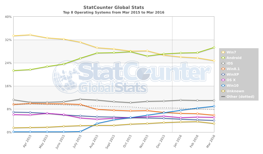
Source: StatCounter Global Stats - OS Market Share
Bootstrap is designed to use various standardized components such as navigation bars, pagination tools, content areas such as grids, image thumbnail collections, etc. You can copy these pieces into your Web site as necessary.
Bootstrap’s component reference lists many of the possibilities, provides a basic example of their use, and includes the code to copy. Bootstrap also has a number of utilities for constructing other features such as pop-ups and dialogs, described in its JavaScript reference. Bootstrap also provides a standard set of styles that are used in these tools, but which can be applied more generally, also. They are described in its CSS reference. When trying to understand Bootstrap’s many style classes, it can be helpful to review this reference.
A few examples of using Bootstrap are provided below; you can see them all in action in the course Web site: http://nrcwg01.eco.umass.edu/gne10/pages/gne058.html.
Installing Bootstrap
Bootstrap Basics
Navigation Controls
Summary
Exercises
Installing Bootstrap
You can download Bootstrap here — get the compiled version (not the source or Sass versions).
The downloaded file provides three folders, fonts, css, and js. The first is a set of Web fonts to provide a specific set of characters or glyphicons; you can drag it to your existing Web site folder. For the other two, you only need the minimized (.min) files, which you can drag into existing folders with the same name:
css
  bootstrap-theme.min.css
  bootstrap-theme.min.css.map
  bootstrap.min.css
  bootstrap.min.css.map
js
  bootstrap.min.js
The map files are used by browsers like Safari, Chrome, and Firefox to map CSS references in the minimized files to make it easier to determine the location of styles while developing. They don’t need to be copied to a remote site.
Once you have the libraries in place, you can create a simple HTML page referencing Bootstrap or start with a template.
Bootstrap Basics
The basic Bootstrap template consists of several required <meta> statements in the <head>, a <link> element to load the Bootstrap CSS, a <script> element to load jQuery, and a <script> element to load the Bootstrap JavaScript. These are included here, along with some basic content from Dodge:
<!DOCTYPE html>
<html lang="en">
    <head>
        <meta charset="utf-8">
        <meta http-equiv="X-UA-Compatible" content="IE=edge">
        <meta name="viewport" content="width=device-width, initial-scale=1">
        <!-- The above 3 meta tags *must* come first in the head; any other head content must come *after* these tags -->
        <meta name="author" content="Alonzo J. Knowlton" />
        <meta name="date" content="1912">
        <title>The Geography of New England</title>
        <!-- Bootstrap -->
        <link href="css/bootstrap.min.css" rel="stylesheet">
        <link href="css/gne.css" type="text/css" rel="stylesheet"></link>
    </head>
    <body>
        <!-- Your content here -->
        <h1><a href="https://books.google.com/books?id=-DREAQAAMAAJ">The Geography of New England</a></h1>
        <!-- jQuery (necessary for Bootstrap's JavaScript plugins) -->
        <script src="js/jquery-2.2.1.min.js"></script>
        <!-- Include all compiled plugins (below), or include individual files as needed -->
        <script src="js/bootstrap.min.js"></script>
    </body>
</html>
There can be additional statements to make it backward-compatible with pre-9 versions of Internet Explorer, but at this time that’s a decreasingly small cohort.
The result is very simple:

We can then add some components to it, starting with a basic container in the <body>:
    <body>
        <div class="container-fluid">
            <h1><a href="https://books.google.com/books?id=-DREAQAAMAAJ">The Geography of New England</a></h1>
            <div id="byline">
                By <span class="author">Lyman R. Allen</span>,
                <span class="credentials">formerly Instructor in Geography, State Normal School, Providence, Rhode Island</span>,<br />
                and <span class="author">Alonzo J. Knowlton</span>,
                <span class="credentials">Superintendent of Schools, Belfast, Maine</span>.
            </div>
            <hr id="titleSeparator" />
        </div>
        ....
    </body>
The class container-fluid provides a full-screen-width container that will resize in a similar fashion to other grid-based containers that follow:

So far this is pretty similar to the previous implementation. Now we’ll add two equal-sized columns of text to it, using Bootstrap’s 12-cell grid system:
The various titles and page headers that are full-page width can be given the class col-sm-12, and the two text columns that are half-page width can be assigned the class col-sm-6:
    <body>
        <div class="container-fluid">
            <div class="col-sm-12">
                <h1><a href="https://books.google.com/books?id=-DREAQAAMAAJ">The Geography of New England</a></h1>
                ....
            </div>
            ....
            <div class="row">
                <div class="col-sm-6">
                    <img width="100%" title="Fig. 108. The State Capitol at Boston."
                        src="images/Dodge_s_Geography_of_New_England%2058_Fig_108.jpg"
                        alt="The Massachusetts State Capitol sits high on a hill overlooking Boston Common."
                    />
                    <h3>Massachusetts Cities and Towns</h3>
                    <h4 id="Fig127">Towns of the Connecticut Valley</h4>
                    <p>In Massachusetts (Fig. 104) the steady drift of the people toward the cities...</p>
                     ....
                </div>
                <div class="col-sm-6">
                    <p>Railroads (Fig. 107) radiating in all directions connect the city with every part of New England as well as with New York and the West...</p>
                     ....
                </div>
            ....
        </div>
        ....
    </body>
The sm means that the columns will collapse at a small screen size or narrow window width, stacking on top of each other, which you can see by comparing these two images:
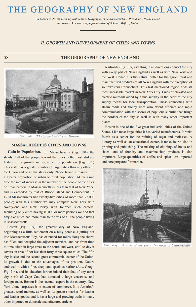

The bottom of the first column and the top of the second column very naturally flow together when the page width narrows and the columns collapse into a stack. Note that the text does not flow by itself from one column to the next, so the choice is made here to break it between paragraphs so that they remain as meaningful units.
You can try this out in the course Web site: http://nrcwg01.eco.umass.edu/gne10/pages/gne058.html.
Other column classes such as col-md-4 and col-lg-8 can be used to force particular column sizes on different screen sizes; check the documentation for more examples.
The images here are given the class="img-responsive", which automatically scales them to width: 100% and also gives them display: block, so that they respond well when the columns narrow.
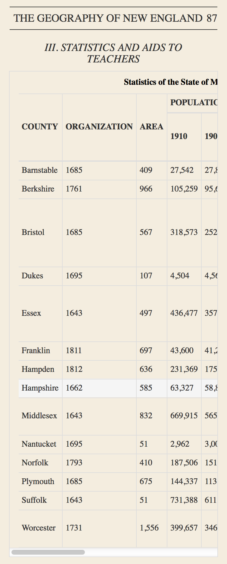 Bootstrap also provides classes to responsively handle tables and add common styling:
    <div class="col-sm-12 table-responsive">
        <table class="table-condensed table-bordered table-hover">
            <caption>Statistics of the State of Massachusetts by Counties from the Federal Census of 1900 and of 1910.</caption>
            ....
        </table>
    </div>
- By wrapping this fairly large table inside a container with
class="table-responsive", a horizontal scrollbar will appear when the container becomes too narrow to hold the table. - With
class="table-condensed", less padding is used, to make a smaller table. - By adding
class="table-bordered", the entire table receives borders. - The option
class="table-hover"automatically adds the CSS pseudoclass:hoverto its rows, which directly responds to mouseovers with a style change (no JavaScript required):.table-hover > tbody > tr:hover {background-color:#f5f5f5}.
You can try this out in the course Web site: http://nrcwg01.eco.umass.edu/gne10/pages/gne087.html.
Navigation Controls
Most Web sites feature navigation bars, those areas at the top of the screen that provide menus, buttons, and links to navigate through a Web site. Bootstrap also provides a nav bar framework to build upon with your own variations. A basic set would include a “brand” (text or icon), a contents menu or a set of page links, and a search box:

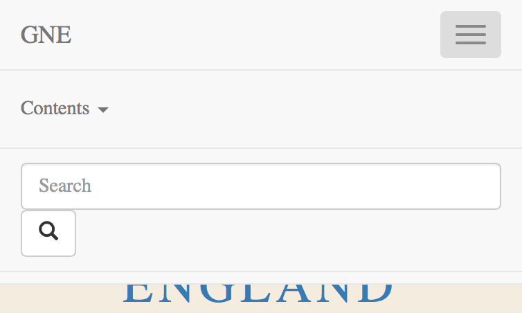
When the screen size collapses below the “medium” screen size, the navigation tools also collapse into a menu that, when clicked, expands to show them.
You can try these out in the course Web site: http://nrcwg01.eco.umass.edu/gne10/pages/gne058.html.
The code to produce this is unfortunately fairly complicated, but it can be broken into two groups, part of which collapses and part of which doesn’t:
<nav class="navbar navbar-default navbar-fixed-top">
    <div class="container-fluid">

        <!-- Brand and toggle get grouped for better mobile display -->
        <div class="navbar-header">
            ....
        </div>

        <!-- Collect the nav links, forms, and other content for toggling -->
        <div class="collapse navbar-collapse" id="navbar-collapse">
            ....
        </div>
    </div>
</nav>
The element <nav> is used here to establish the unique meaning of this structure. It has two standard Bootstrap classes, navbar and navbar-default, but also an optional class navbar-fixed-top that fixes the bar at the top of the screen, rather than allowing it to scroll up out of view.
The element <div class="container-fluid"> we saw previously, allowing the contents of the navigation bar to collapse at specific screen sizes.
The element <div class="navbar-header"> contains the items that remain in place when the screen collapses, the “brand” and a menu:
<div class="navbar-header">
    <button type="button" class="navbar-toggle collapsed" data-toggle="collapse" data-target="#navbar-collapse" aria-expanded="false">
        <span class="sr-only">Toggle navigation</span>
        <span class="icon-bar"></span>
        <span class="icon-bar"></span>
        <span class="icon-bar"></span>
    </button>
    <a class="navbar-brand" href="gne001.html">GNE</a>
</div>
- The second item in the navbar header
<a class="navbar-brand" href="page001.html">GNE</a>is the “brand”, implemented here as a hyperlink that can be connected to an appropriate “Home” or “About” page, e.g. the title page of the book. - The first item is a menu that appears after collapse, which is implemented as a
<button>element that is very similar to the element<input type="button">we saw previously. - The main advantage of a
<button>element is that it can enclose any HTML structure and turn it into a button. Here that’s a stack of three “icon bars”, empty<span>elements displayed as narrow blocks with borders:. - The button attribute
class="navbar-toggle collapsed"indicates to Bootstrap that the button should act as a toggle for a menu, and that initially it is in a collapsed (hidden) state. - The button’s child HTML also has a
<span class="sr-only">element that is only noticed by the screen readers used by people with a visual impairment, to explain the purpose of the button. The button itself makes use of the attributearia-expanded="false", one of a suite of Accessible Rich Internet Applications (ARIA) attributes that textually describe the purpose of elements that might otherwise be hard to interpret visually. When the button becomes visible, the attribute should be modified by script toaria-expanded="true".
The button attributes data-target="#navbar-collapse" and data-toggle="collapse" store Bootstrap-defined information about the other piece of code that should respond when the button appears. In this case, that’s the second element in the nav bar, which contains two groups of controls holding the Contents menu and the Search controls:

<div class="collapse navbar-collapse" id="navbar-collapse">
    <ul class="nav navbar-nav navbar-left" role="navigation">
        ....
    </ul>
    <form class="navbar-form navbar-right" role="search">
        ....
    </form>
</div>
- The
<div>classescollapseandnavbar-collapseagain tell Bootstrap that everything here will collapse when the screen is small enough. - The first set of controls is implemented as an unordered list
<ul>:- It is bulletless and horizontal due its classes
navandnavbar-nav; - It is positioned to the left due to the class
navbar-left; - It has the ARIA attribute
roledefined asnavigation.
- It is bulletless and horizontal due its classes
- The second set of controls is implemented as a
<form>element, which is used to submit user input to a Web server for processing (we’ll learn more about that later).- It is positioned to the left due to the class
navbar-right; - It has the ARIA attribute
roledefined assearch.
- It is positioned to the left due to the class
Within the navigation list, there can be multiple controls, often links to other pages in the site. Here there is just a single drop-down menu that reveals a list of items:
<ul class="nav navbar-nav navbar-left">
    <li class="dropdown">
        <a href="#" class="dropdown-toggle" data-toggle="dropdown" role="button"
            aria-haspopup="true" aria-expanded="false">Contents <span class="caret"></span></a>
        <ul class="dropdown-menu">
            <li><a href="page003.html">The Introduction</a></li>
            <li class="divider" role="separator"></li>
            <li><a href="gne007.html">I. New England as a Whole</a></li>
            <li><a href="gne053.html">II. Growth and Development of Cities and Towns</a></li>
            <li><a href="gne087.html">III. Statistics and Aids to Teachers</a></li>
            <li class="divider" role="separator"></li>
            <li><a href="gne105.html">The Index</a></li>
        </ul>
    </li>
</ul>
The menu is a single list item <li class="dropdown">, beginning with the menu name Contents followed by another CSS-generated geometric figure (called here caret although it is not one). This text is wrapped inside of an anchor element <a> with class="dropdown-toggle" with role="button", plus a couple of other ARIA attributes aria-haspopup="true" and aria-expanded="false". The drop-down menu is again implemented as an unordered list with no bullets <ul class="dropdown-menu">, which is positioned at the bottom of the <li> (the same way the summary data was positioned to the right of the column header in the table of Massachusetts counties).
The search tools are implemented inside of a <form> element, which associates an input text field with a button that submits the text for processing:
<form class="navbar-form navbar-right" role="search">
    <div class="form-group">
        <input type="text" class="form-control" aria-label="Search"
            placeholder="Search">
        <button type="submit" class="btn btn-default">
            <span class="glyphicon glyphicon-search" aria-hidden="true"></span>
        </button>
    </div>
</form>
The <input type="text"> field uses the attribute placeholder="Search" to set background text, which automatically disappears when a user clicks in the box. Because this may not be clear to a user with a visual impairment, a separate attribute aria-label="Search" is provided for screen readers.
 The
The <button type="submit"> element surrounds a <span> element that references a magnifying glass character, called a glyphicon, from the fonts folder that is included with Bootstrap.
Additional components can be dropped in place once the framework is understood. For example, a breadcrumb, i.e. a pathway downward from the Web site’s origin to the current page, along with a pair of pagination buttons, could be added to the navbar header, so that they remain visible on collapse:

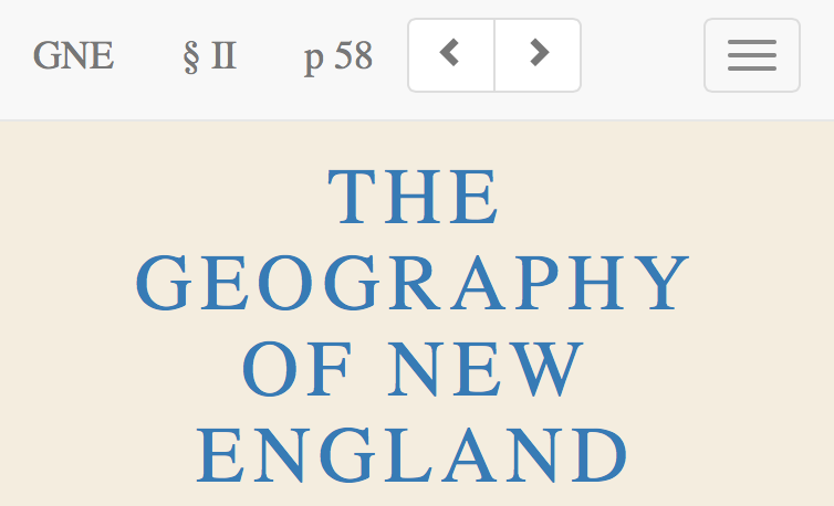
<nav class="navbar navbar-default navbar-fixed-top">
    <div class="container-fluid">
        <div class="navbar-header">
            <button type="button" class="navbar-toggle collapsed" ...>...</button>
            <a class="navbar-brand" href="gne001.html">GNE</a>
            <a class="navbar-brand" href="gne053.html">§ II</a>
            <a class="navbar-brand" href="#">p 58 <span class="sr-only">(current)</span></a>
            <ul class="nav navbar-nav pagination">
                <li>
                    <a href="gne057.html" aria-label="Previous"
                        role="button"><span class="glyphicon glyphicon-chevron-left"
                            aria-hidden="true"></span></a>
                </li>
                <li>
                    <a href="gne059.html" aria-label="Next" role="button"><span
                            class="glyphicon glyphicon-chevron-right"
                            aria-hidden="true"></span></a>
                </li>
            </ul>
        </div>
        ....
    </div>
</nav>
The pages in the breadcrumb are formatted the same as the brand, but an additional <span class="sr-only">(current)</span> is appended to the page number so that a screen reader will know it’s the current page. The latter’s link is set only to #, which when clicked takes one to the top of the page. This was adapted from Bootstrap’s dedicated breadcrumb component.
The pagination buttons are again a bullet-less unordered list with anchor elements referencing adjacent pages. Note the ARIA labels that describe what the purpose of the buttons are, aria-label="Previous" and aria-label="Next". These buttons as pulled from the Bootstrap reference don’t fit properly within the header (they may have been intended for a footer), so their CSS is also modified to reduce their vertical margins:
.pagination { margin-top: 8px; margin-bottom: 6px; }
You can generally expect to make these kind of adjustments when sticking Bootstrap into your pages.
Summary
- The Bootstrap Web framework provides a collection of components that make it easier to layout a Web page and use common features in Web sites.
- Some of the components include gridded layout for content, styles to make images and table mobile-friendly, and other styles and JavaScript to facilitate common Web site activities.
- A navigation bar framework provides common tools at the top (or bottom) of a Web page.
Exercises
In the Exercises in Chapter 9, you created a Web page for Massachusetts called gne.html with styles stored in gne.css and scripts stored in js. You can download the reference version of these documents from http://nrcwg01.eco.umass.edu/gne9x/ (that’s advised here because the towns have been implemented in an easier-to-use format — check it out!).
Try adding a grid layout and a navigation bar to this document, and maybe some others that you find of interest.